> ## Documentation Index
> Fetch the complete documentation index at: https://docs.reown.com/llms.txt
> Use this file to discover all available pages before exploring further.
# Customization
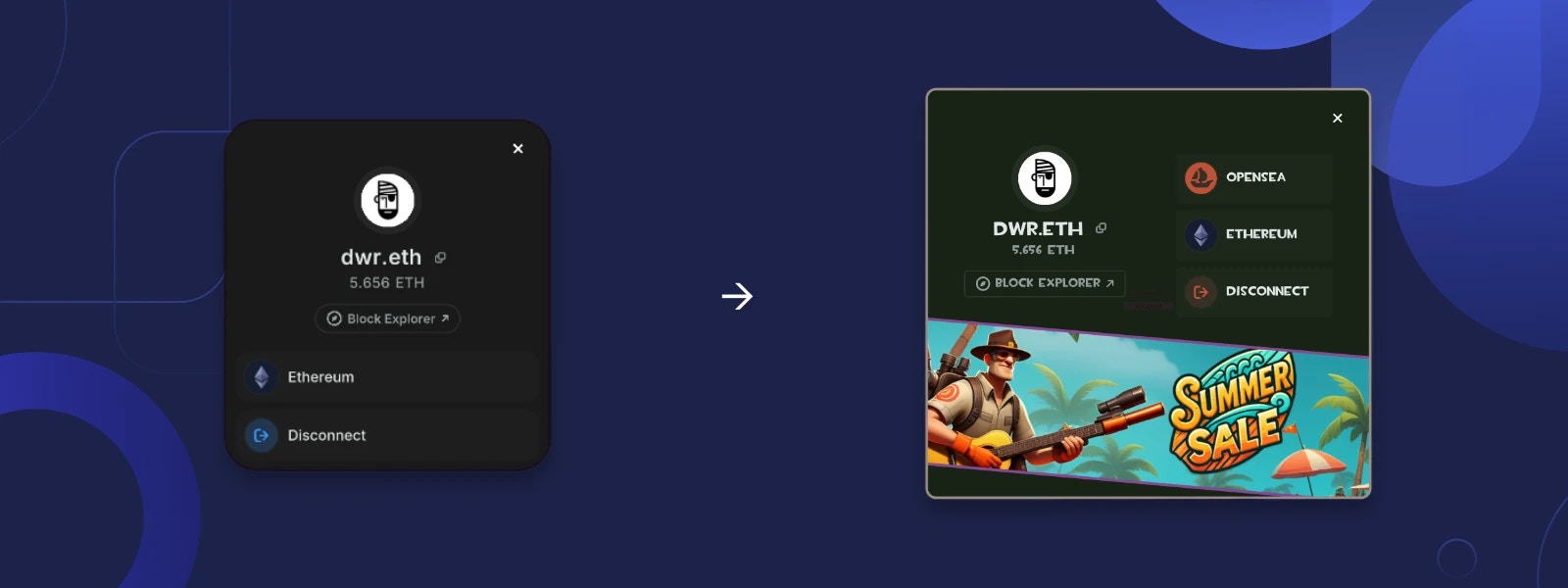
The AppKit uses Unity's [UI Toolkit](https://docs.unity3d.com/Manual/UIElements.html) system.
By following this guide,you can customize the AppKit to match your game's style, even if you have minimal or no prior
knowledge of UI Toolkit.
 ## Theming
The AppKit relies heavily on [Unity Style Sheet (USS) variables](https://docs.unity3d.com/Manual/UIE-USS-variables.html)
for easy customization of various UI aspects, such as colors, spacing, border radius, and more.
### Preparation
The first step in theming the AppKit is to create a custom panel settings asset, followed by a custom theme file.
Then, link them to the AppKit.
1. In Unity Editor, right-click in the Project window and select **Create -> UI Toolkit -> Panel Settings Asset**.
2. Right-click again in the Project window and select **Create -> UI Toolkit -> TSS Theme File**.
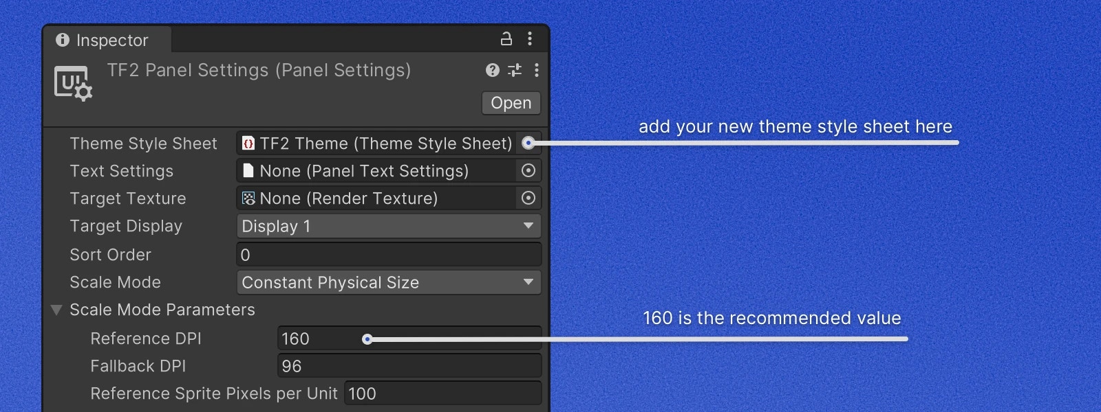
3. Select the newly created Panel Settings Asset, and in the Inspector window, assign the newly created TSS Theme File
to the `Theme Style Sheet` field.
4. In the same Inspector window, set `Reference DPI` to 160. This is the recommended DPI for the AppKit, but feel free
to adjust it to your needs.
## Theming
The AppKit relies heavily on [Unity Style Sheet (USS) variables](https://docs.unity3d.com/Manual/UIE-USS-variables.html)
for easy customization of various UI aspects, such as colors, spacing, border radius, and more.
### Preparation
The first step in theming the AppKit is to create a custom panel settings asset, followed by a custom theme file.
Then, link them to the AppKit.
1. In Unity Editor, right-click in the Project window and select **Create -> UI Toolkit -> Panel Settings Asset**.
2. Right-click again in the Project window and select **Create -> UI Toolkit -> TSS Theme File**.
3. Select the newly created Panel Settings Asset, and in the Inspector window, assign the newly created TSS Theme File
to the `Theme Style Sheet` field.
4. In the same Inspector window, set `Reference DPI` to 160. This is the recommended DPI for the AppKit, but feel free
to adjust it to your needs.
 5. Open the TSS Theme File with your code editor and change the first line to:
```css theme={null}
@import url("/Packages/com.reown.appkit.unity/UI Toolkit/AppKit Base Theme.tss");
```
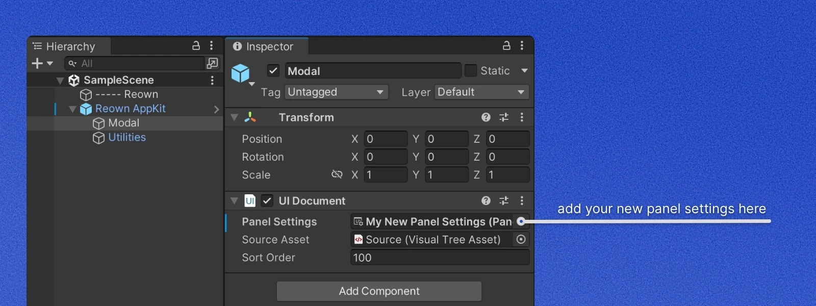
6. Under `Reown AppKit` prefab instance in your scene or prefab find `Modal` child object and assign the
newly created `Panel Settings Asset` to the `Panel Settings` field of `UI Document` component.
5. Open the TSS Theme File with your code editor and change the first line to:
```css theme={null}
@import url("/Packages/com.reown.appkit.unity/UI Toolkit/AppKit Base Theme.tss");
```
6. Under `Reown AppKit` prefab instance in your scene or prefab find `Modal` child object and assign the
newly created `Panel Settings Asset` to the `Panel Settings` field of `UI Document` component.
 Everything is set up, now you can start customizing the AppKit to match your game's style.
### Overriding Variables
To override a variable, simply add it to your TSS Theme File and assign a new value to it.
The example below changes the accent color to a shade of orange and the modal border color to a shade of gray.
```css theme={null}
@import url("/Packages/com.reown.appkit.unity/UI Toolkit/AppKit Base Theme.tss");
* {
--ro-color-accent-100: rgb(156, 81, 65);
--ro-accent-glass-090: rgba(156, 81, 65, 0.9);
--ro-accent-glass-080: rgba(156, 81, 65, 0.8);
--ro-accent-glass-020: rgba(156, 81, 65, 0.2);
--ro-accent-glass-015: rgba(156, 81, 65, 0.15);
--ro-accent-glass-010: rgba(156, 81, 65, 0.1);
--ro-accent-glass-005: rgba(156, 81, 65, 0.05);
--ro-accent-glass-002: rgba(156, 81, 65, 0.02);
}
Modal {
--ro-modal-border-color: #9a9085;
--ro-modal-border-width: 3px;
}
```
You can find the list of all available variables in the [AppKit Base Theme](https://github.com/reown-com/reown-dotnet/blob/main/src/Reown.AppKit.Unity/UI%20Toolkit/AppKit%20Base%20Theme.tss)
file.
If you find that a variable is missing, please [open a GitHub issue](https://github.com/reown-com/reown-dotnet/issues).
We will be happy to add it for you.
### Custom Fonts
To override the default font, you need to add a custom font to your project and reference it in the TSS Theme File.
```css theme={null}
@import url("/Packages/com.reown.appkit.unity/UI Toolkit/AppKit Base Theme.tss");
* {
-unity-font-definition: resource("Custom Fonts/Comic Sans SDF Regular");
}
```
From the point of font asset management, the TextCore engine is very similar to TextMesh Pro. Please refer to
the [UI Toolkit documentation](https://docs.unity3d.com/Manual/UIE-get-started-with-text.html) for more information.
## Advanced Customization
The AppKit follows the MVP (Model-View-Presenter) architecture, allowing you to customize the UI and behavior by
replacing the default views and presenters with your own. Views load UXML layout files from the Resources folder and
configure bindings. Presenters handle the business logic and communicate with the views. In some cases, presenters can
build views dynamically and pass them to another view. Below are two examples showing how to customize both static
UXML-based views and dynamic views.
### Dynamic View Customization
The Account view has a list of buttons at the bottom. At the moment of writing, there are only two buttons in the list:
`Network` and `Disconnect`. Because in the future this list will include more buttons, some of which will depend
on project configuration, the list is built dynamically inside of `AccountPresenter`. In this example we will be
adding a custom button that opens OpenSea profile page of connected account.
Let's create a custom presenter and override the method that creates the bottom buttons list.
```csharp theme={null}
public class CustomAccountPresenter : AccountPresenter
{
public CustomAccountPresenter(RouterController router, VisualElement parent) : base(router, parent)
{
}
protected override void CreateButtons(VisualElement buttonsListView)
{
base.CreateButtons(buttonsListView);
}
}
```
Let's copy the button creation code from the base presenter and modify it to create an OpenSea button.
```csharp theme={null}
private void CreateOpenSeaButton(VisualElement buttonsListView)
{
var openSeaIcon = Resources.Load("OpenSea Logo");
var openSeaButton = new ListItem(
"OpenSea",
openSeaIcon,
OnOpenSeaButtonClick,
iconType: ListItem.IconType.Circle,
iconStyle: ListItem.IconStyle.Accent);
Buttons.Add(openSeaButton);
buttonsListView.Add(openSeaButton);
}
private void OnOpenSeaButtonClick()
{
var address = AppKit.AccountController.Address;
var url = $"https://opensea.io/{address}";
Application.OpenURL(url);
}
```
Now we need to call `CreateOpenSeaButton` method from `CreateButtons` method. The final presenter should look like this:
```csharp theme={null}
public class CustomAccountPresenter : AccountPresenter
{
public CustomAccountPresenter(RouterController router, VisualElement parent) : base(router, parent)
{
}
protected override void CreateButtons(VisualElement buttonsListView)
{
CreateOpenSeaButton(buttonsListView);
base.CreateButtons(buttonsListView);
}
private void CreateOpenSeaButton(VisualElement buttonsListView)
{
var openSeaIcon = Resources.Load("OpenSea Logo");
var openSeaButton = new ListItem(
"OpenSea",
openSeaIcon,
OnOpenSeaButtonClick,
iconType: ListItem.IconType.Circle,
iconStyle: ListItem.IconStyle.Accent);
Buttons.Add(openSeaButton);
buttonsListView.Add(openSeaButton);
}
private void OnOpenSeaButtonClick()
{
var address = AppKit.AccountController.Address;
var url = $"https://opensea.io/{address}";
Application.OpenURL(url);
}
}
```
The last step is to replace the default presenter with the custom one.
All screens in the AppKit modal (e.g. Account, Wallet Search, QR Code, etc.) are called `modal view`. The class that
is responsible for storing, hiding, and showing the modal views is `RouterController`. To replace a modal view implementation
with a custom one, you need to create a custom presenter and pass it to the `RegisterModalView` method of `RouterController`.
```csharp theme={null}
// Get a reference to ModalController and cast it to ModalControllerUtk.
// ModalControllerUtk is used by UI Toolkit version of the AppKit.
// It's used on all platforms except WebGL.
var modalController = (ModalControllerUtk)AppKit.ModalController;
if (modalController != null)
{
// Get RouterController
var routerController = modalController.RouterController;
// Create an instance of the custom presenter and register it as a `Account` modal view.
var customAccountPresenter = new CustomAccountPresenter(routerController, routerController.RootVisualElement);
routerController.RegisterModalView(ViewType.Account, customAccountPresenter);
}
```
You can register modal views at any point in the game lifecycle. The `RouterController` will dispose of the previous
presenter and replace it with the new one.
If you find that some parts of the presenter can't be customized, please [open a GitHub issue](https://github.com/reown-com/reown-dotnet/issues).
### Static View Customization
All core views in the AppKit accept optional path to the UXML layout file in the constructor.
Let's extend the `CustomAccountPresenter` class we made in the previous example to use a custom UXML layout file.
To do so, override `CreateViewInstance` method and return a new instance of `AccountView` with a custom UXML layout path.
```csharp theme={null}
protected override AccountView CreateViewInstance()
{
return new AccountView("UI/CustomAccountView");
}
```
Make sure to link original or custom USS file from your UXML layout file.
## Example
You can find a complete example of the customization in the [Customization](https://github.com/reown-com/reown-dotnet/tree/main/playground/Reown.Customization.Unity)
example project.
Everything is set up, now you can start customizing the AppKit to match your game's style.
### Overriding Variables
To override a variable, simply add it to your TSS Theme File and assign a new value to it.
The example below changes the accent color to a shade of orange and the modal border color to a shade of gray.
```css theme={null}
@import url("/Packages/com.reown.appkit.unity/UI Toolkit/AppKit Base Theme.tss");
* {
--ro-color-accent-100: rgb(156, 81, 65);
--ro-accent-glass-090: rgba(156, 81, 65, 0.9);
--ro-accent-glass-080: rgba(156, 81, 65, 0.8);
--ro-accent-glass-020: rgba(156, 81, 65, 0.2);
--ro-accent-glass-015: rgba(156, 81, 65, 0.15);
--ro-accent-glass-010: rgba(156, 81, 65, 0.1);
--ro-accent-glass-005: rgba(156, 81, 65, 0.05);
--ro-accent-glass-002: rgba(156, 81, 65, 0.02);
}
Modal {
--ro-modal-border-color: #9a9085;
--ro-modal-border-width: 3px;
}
```
You can find the list of all available variables in the [AppKit Base Theme](https://github.com/reown-com/reown-dotnet/blob/main/src/Reown.AppKit.Unity/UI%20Toolkit/AppKit%20Base%20Theme.tss)
file.
If you find that a variable is missing, please [open a GitHub issue](https://github.com/reown-com/reown-dotnet/issues).
We will be happy to add it for you.
### Custom Fonts
To override the default font, you need to add a custom font to your project and reference it in the TSS Theme File.
```css theme={null}
@import url("/Packages/com.reown.appkit.unity/UI Toolkit/AppKit Base Theme.tss");
* {
-unity-font-definition: resource("Custom Fonts/Comic Sans SDF Regular");
}
```
From the point of font asset management, the TextCore engine is very similar to TextMesh Pro. Please refer to
the [UI Toolkit documentation](https://docs.unity3d.com/Manual/UIE-get-started-with-text.html) for more information.
## Advanced Customization
The AppKit follows the MVP (Model-View-Presenter) architecture, allowing you to customize the UI and behavior by
replacing the default views and presenters with your own. Views load UXML layout files from the Resources folder and
configure bindings. Presenters handle the business logic and communicate with the views. In some cases, presenters can
build views dynamically and pass them to another view. Below are two examples showing how to customize both static
UXML-based views and dynamic views.
### Dynamic View Customization
The Account view has a list of buttons at the bottom. At the moment of writing, there are only two buttons in the list:
`Network` and `Disconnect`. Because in the future this list will include more buttons, some of which will depend
on project configuration, the list is built dynamically inside of `AccountPresenter`. In this example we will be
adding a custom button that opens OpenSea profile page of connected account.
Let's create a custom presenter and override the method that creates the bottom buttons list.
```csharp theme={null}
public class CustomAccountPresenter : AccountPresenter
{
public CustomAccountPresenter(RouterController router, VisualElement parent) : base(router, parent)
{
}
protected override void CreateButtons(VisualElement buttonsListView)
{
base.CreateButtons(buttonsListView);
}
}
```
Let's copy the button creation code from the base presenter and modify it to create an OpenSea button.
```csharp theme={null}
private void CreateOpenSeaButton(VisualElement buttonsListView)
{
var openSeaIcon = Resources.Load("OpenSea Logo");
var openSeaButton = new ListItem(
"OpenSea",
openSeaIcon,
OnOpenSeaButtonClick,
iconType: ListItem.IconType.Circle,
iconStyle: ListItem.IconStyle.Accent);
Buttons.Add(openSeaButton);
buttonsListView.Add(openSeaButton);
}
private void OnOpenSeaButtonClick()
{
var address = AppKit.AccountController.Address;
var url = $"https://opensea.io/{address}";
Application.OpenURL(url);
}
```
Now we need to call `CreateOpenSeaButton` method from `CreateButtons` method. The final presenter should look like this:
```csharp theme={null}
public class CustomAccountPresenter : AccountPresenter
{
public CustomAccountPresenter(RouterController router, VisualElement parent) : base(router, parent)
{
}
protected override void CreateButtons(VisualElement buttonsListView)
{
CreateOpenSeaButton(buttonsListView);
base.CreateButtons(buttonsListView);
}
private void CreateOpenSeaButton(VisualElement buttonsListView)
{
var openSeaIcon = Resources.Load("OpenSea Logo");
var openSeaButton = new ListItem(
"OpenSea",
openSeaIcon,
OnOpenSeaButtonClick,
iconType: ListItem.IconType.Circle,
iconStyle: ListItem.IconStyle.Accent);
Buttons.Add(openSeaButton);
buttonsListView.Add(openSeaButton);
}
private void OnOpenSeaButtonClick()
{
var address = AppKit.AccountController.Address;
var url = $"https://opensea.io/{address}";
Application.OpenURL(url);
}
}
```
The last step is to replace the default presenter with the custom one.
All screens in the AppKit modal (e.g. Account, Wallet Search, QR Code, etc.) are called `modal view`. The class that
is responsible for storing, hiding, and showing the modal views is `RouterController`. To replace a modal view implementation
with a custom one, you need to create a custom presenter and pass it to the `RegisterModalView` method of `RouterController`.
```csharp theme={null}
// Get a reference to ModalController and cast it to ModalControllerUtk.
// ModalControllerUtk is used by UI Toolkit version of the AppKit.
// It's used on all platforms except WebGL.
var modalController = (ModalControllerUtk)AppKit.ModalController;
if (modalController != null)
{
// Get RouterController
var routerController = modalController.RouterController;
// Create an instance of the custom presenter and register it as a `Account` modal view.
var customAccountPresenter = new CustomAccountPresenter(routerController, routerController.RootVisualElement);
routerController.RegisterModalView(ViewType.Account, customAccountPresenter);
}
```
You can register modal views at any point in the game lifecycle. The `RouterController` will dispose of the previous
presenter and replace it with the new one.
If you find that some parts of the presenter can't be customized, please [open a GitHub issue](https://github.com/reown-com/reown-dotnet/issues).
### Static View Customization
All core views in the AppKit accept optional path to the UXML layout file in the constructor.
Let's extend the `CustomAccountPresenter` class we made in the previous example to use a custom UXML layout file.
To do so, override `CreateViewInstance` method and return a new instance of `AccountView` with a custom UXML layout path.
```csharp theme={null}
protected override AccountView CreateViewInstance()
{
return new AccountView("UI/CustomAccountView");
}
```
Make sure to link original or custom USS file from your UXML layout file.
## Example
You can find a complete example of the customization in the [Customization](https://github.com/reown-com/reown-dotnet/tree/main/playground/Reown.Customization.Unity)
example project.