AppKit provides pre-built React components that you can use to trigger the modal or display wallet information in your Next.js application.

React Components

Component Properties

All React components support the same properties as their HTML element counterparts:
  • AppKitButton: size, label, loadingLabel, disabled, balance, namespace
  • AppKitConnectButton: size, label, loadingLabel
  • AppKitAccountButton: disabled, balance
  • AppKitNetworkButton: disabled

<appkit-wallet-button />
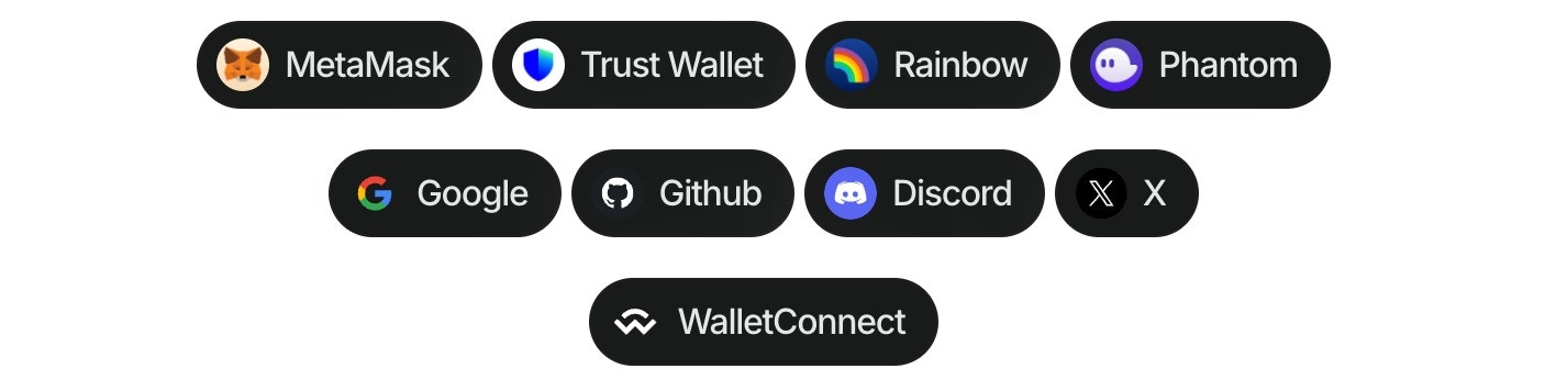
Using the wallet button components (Demo in our Lab), you can directly connect to more than 40 of the top wallets globally, WalletConnect QR, and all the social logins. This component allows to customize dApps, enabling users to connect their wallets effortlessly, all without the need for the traditional modal. Follow these steps to use the component:
  1. Install the package:
  1. Import the library in your project:
  1. use the component in your project:

Multichain Support

You can specify a blockchain namespace to target specific chains:

Enhanced Multichain Examples

The wallet button now supports enhanced multichain functionality with improved namespace targeting:

Options for wallet property

TypeOptions
QR CodewalletConnect
Walletsmetamask, trust, coinbase, rainbow, jupiter, solflare, coin98, magic-eden, backpack, frontier, xverse, okx, bitget, leather, binance, uniswap, safepal, bybit, phantom, ledger, timeless-x, safe, zerion, oneinch, crypto-com, imtoken, kraken, ronin, robinhood, exodus, argent, tokenpocket, haha, ambire-wallet, bitpay, blade-wallet, brave, coinstats, kresus-superapp, plena-app, status, tomo-wallet, valora, and zengo-wallet
Social loginsgoogle, github, apple, facebook, x, discord, and farcaster

Options for namespace property

ValueDescription
eip155Ethereum and EVM-compatible chains
solanaSolana blockchain
bip122Bitcoin blockchain